
🌎 NY Climate Week debrief
Takeaways from five days of hallway and main-stage conversations at NYCW
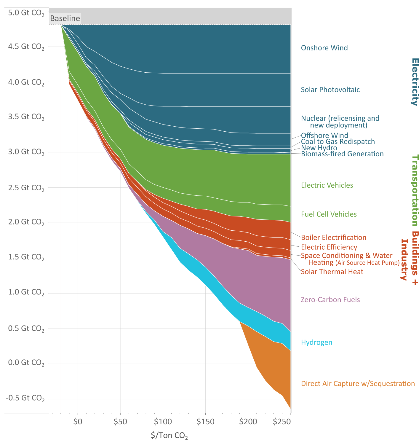
EDF’s update to the 2007 McKinsey MACC charts the course to 2050 Net Zero
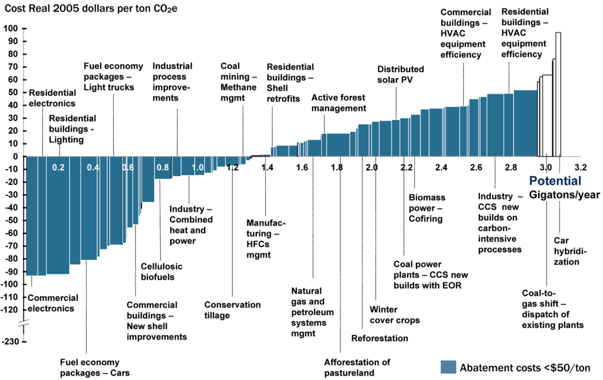
Energy nerds worldwide will likely recognize the iconic 2007 McKinsey Marginal Abatement Cost Curve’s from miles away. This week, a new shape had #EnergyTwitter macking on its curves. The EDF MAC 2.0 Curve has entered the chat. Using the latest energy models, the Environmental Defense Fund teamed up with Evolved Energy Research to (literally) flip the McKinsey MACC on its head and create a roadmap for policymakers and innovation investors alike to drive US energy and industrial carbon dioxide emissions to zero by 2050. CTVC readers had questions - so we went straight to the source and Zoomed in with the EDF and Evolved teams to learn more about what the report means for climate technology development and investing.
What’s the history of climate Marginal Abatement Cost Curves? Why are they a useful tool?
The history begins with McKinsey popularizing the curves as a really simple and coherent way to compare the cost and emissions impact of different decarbonization measures. The original McKinsey curve in 2007 spawned other analyses over the next 5-7 years but work in this space has fallen off more recently. We’re trying to address some of their shortcomings, particularly with an eye toward net-zero emission targets.
What does marginal abatement cost mean? How should we read MACCs?
Marginal abatement cost refers to the amount of money it takes to reduce emissions by a specific amount. The marginal component is important because it refers to the incremental reduction of emissions, and it helps provide an answer to the question of how much each marginal reduction costs. Let’s talk about the axes on this graph. The first is the price of emissions reductions, in other words the marginal abatement cost. The second is the amount of emissions abatement achieved at a given cost.
MACCs try to give us a relative understanding of the technologies that can most cost-effectively deliver emissions reductions. To some readers, this might look like a supply curve, suggesting that technologies should be deployed sequentially from low to high cost, but it shouldn’t be interpreted that way. There are often times when it makes sense to invest in more expensive measures earlier to get them ready for deployment later, or because their stock turnover is slow - so it really needs to be seen as a comprehensive view of all the measures.
The traditional version of an MACC was static: it presented technological costs at a static moment in time, and didn't consider how the technologies might interact in the energy system or how to scale and sequence investments over time — questions that matter enormously for driving down emissions at the pace and scale we need.
Why did the McKinsey MACC need an update?
It's hard to navigate the path to a net zero system - a transformational goal - by considering the costs of technologies frozen in time. We need a MACC that takes a systems approach. It needs to incorporate factors including the time it takes to innovate and bring down costs, the changing make-up of the grid over time, and the interdependencies between technologies.
As an example, the success of EV deployment and the availability of green hydrogen from electrolysis depend on the amount of renewables in the energy system – because that's all powered by the grid. More renewable deployment in our model is a critical enabler for decarbonization of other sectors, so it’s extremely important to get the grid as clean as possible.
And there can be more than one aspect of “considering the interactions.” For each technology, the marginal abatement cost changes depending on the level of deployment. For example, once you reach a certain point of renewable deployment, you have to also pay to implement transmission and other grid modernization features. This new model is able to unpack these interactions and weave in the variety of impacts that each system has on another.
What do the deployment trajectories of different technologies look like over time through 2050?
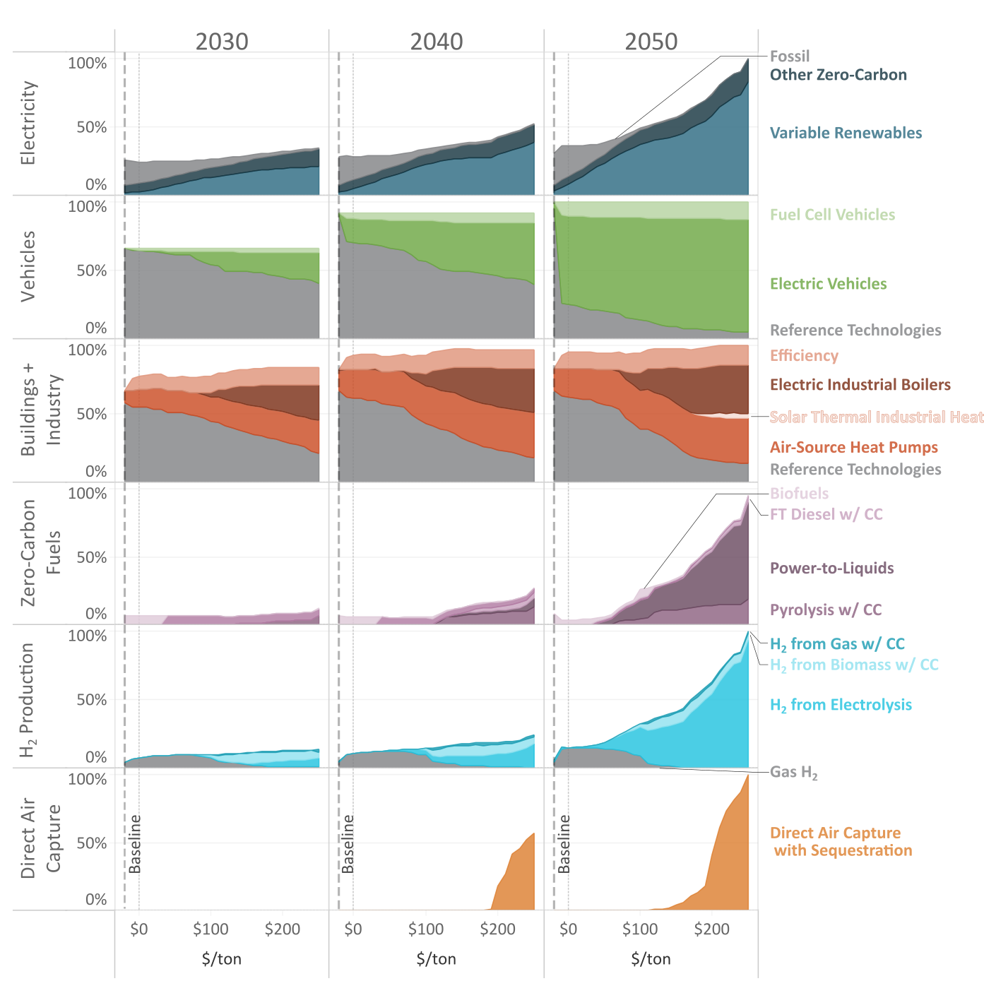
The MAC 2.0 Curve is just a snapshot of all of the emissions reductions that we’re able to achieve by 2050. We also ran the model for separate years - 2030, 2040, and 2050.
The figure above shows the deployment of technologies over time. The X-axis is the same marginal abatement cost as in the first MACC figure, and the Y axis shows the deployment levels normalized at 100% to demonstrate the relative scale of change.
With this chart, you can really visualize how different measures are often deployed at different scales and in different time periods across the range of marginal abatement costs. For example, electric boilers are gradually growing over time at marginal abatement costs above $100. That contrasts with direct air capture where you hit a certain price point and it really takes off because it’s cost-effective.
What new inputs did you include in the EDF MAC 2.0 update?
In addition to updating the overall methodology and cost assumptions, we also included new technologies that were not included in past MAC curves. The new technologies matter both because deeper decarbonization goals will require technologies that weren’t widely considered fifteen years ago, and because other curves compared everything to a static fossil fuel baseline. Certain approaches would have increased emissions because they would have been powered by a dirty grid. In our model, we're updating the baseline to be cleaner over time, which enables technologies like an electric boiler to drive emissions reductions.
Let’s run with the electric boiler example. What’s the relationship between decarbonizing the grid while bringing technologies like electric boilers online?
This is a great example to highlight why capturing innovation, cost declines, and other sectoral changes really matters. Generally, we see the broader category of electrified technologies as much more energy efficient than their fossil counterparts. However, industrial electric boilers are only slightly more energy efficient than their fossil-combustion alternatives, and in many areas in the US, swapping out natural gas industrial boilers for electric boilers today would increase emissions because the grid is still dirty.
Our new approach looks at the impact of each measure as the grid gets cleaner and the energy system evolves, so we can determine when electric boilers become a viable decarbonization measure.
How did you define the universe of technologies included in the chart?
This new MACC only represents measures decarbonizing the US energy and industry sectors. Our list of measures for these sectors includes much of what we currently understand to be key drivers of emission reductions, but is not comprehensive. That’s not to say that other measures that weren’t in this initial MACC 2.0 analysis aren't important components of climate solutions, but within these sectors we have well-characterized data and some consensus around projections.
Nature-based solutions, soils, forests, and agriculture are all critical for reaching our climate goals, but we lack a lot of good data on how they tick. In our model, we wanted to get as defensible and rigorous an answer within the frame that we were able to work in. In the future, we would hope that we have improved access to data because it's going to be really important for future analyses to be able to handle those parts of the picture too. We’re just not there yet.
How do frontier technologies like nuclear fusion or long-duration storage play into this? Are they needed?
This analysis didn’t include those measures, so we can’t speak to how they would change the curve. For many nascent technologies, we didn’t have literature with good enough cost projections to be included in the model; nuclear fusion would fall in this category. The Evolved team has done analyses in other contexts with nascent long-duration storage technologies, and have seen some interesting dynamics trading off efficiency, utilization and the costs of alternatives. Given publicly available pricing for long duration storage technologies, we knew these technologies wouldn’t be cost-effective given alternatives, and didn’t include them.
It’s important to note that our results are not what we're prescribing as the only path to net zero for energy and industry - it’s the least-cost path that we were able to model based on the best data on hand and insights from similar recent studies. We want to continue to update this MAC curve periodically as new technologies become available and once there is enough data behind them to be able to incorporate them into the model.
Some technologies are already cost-effective (e.g. <$0/ton cost). What’s already accessible and how far to Net Zero do they get us?
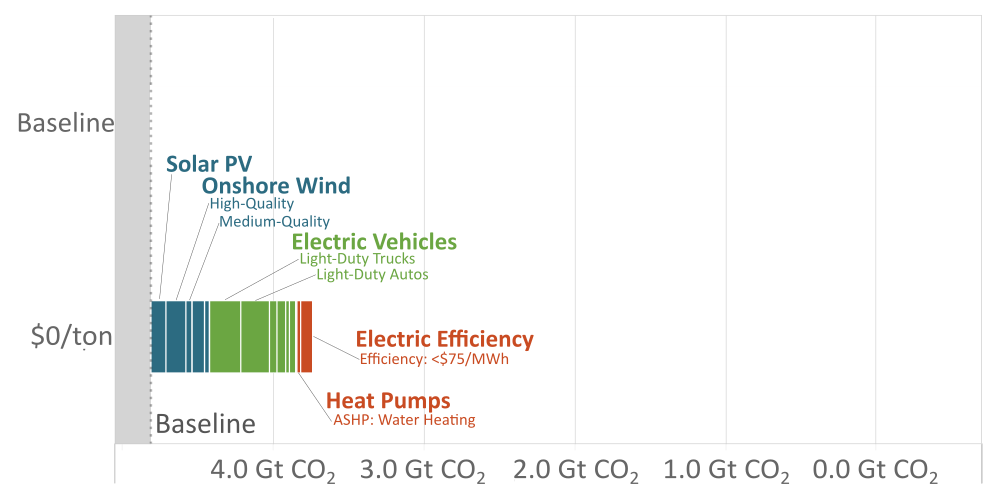
A lot of technologies are already cost-effective (e.g. $0 or less). These get us 1 gigaton of emissions reductions, or ~22% of the way to net-zero in energy and industry. The ones that are $60 or less get us almost halfway to net-zero. Of those that are currently cost-effective, we’d point to several different electric vehicle classes, energy efficiency, high-quality solar PV, onshore wind, nuclear relicensing, and - to some extent - heat pumps and buildings as well.
But all that being said, that's just the cost side of the equation. There are all kinds of policy and behavioral challenges preventing full deployment right now. At EDF, we spend a lot of time addressing those policy challenges. For example, the suite of clean energy tax credits and investments being discussed in the Senate right now would go a long way toward accelerating deployment.
How did your model handle stock turnover and the potential for transitions to new technologies to create stranded assets?
Stock turnover dynamics are baked into the model. This is particularly relevant for demand-side technologies going into the buildings, transportation and industrial sectors. We modeled the expected useful life of the existing stock and how that stock is evolving over time. We're capturing when the clean versions of those technologies get deployed and that is reflected in the stock turnover. It’s also true for the supply side.
Are there policy levers to take the dirty stuff offline faster (e.g. stranded assets)?
Generally speaking, taking investments offline before they’ve served their full, useful life is a major challenge, and can be a serious barrier to transitioning to a cleaner sector. One of the better-known programs that did this was "cash for clunkers," which allowed people to turn in their old inefficient cars to purchase a new one. There has been both great praise and great criticism of that program, and there will always be questions about whether they are the most efficient use of taxpayer dollars. But it was an incredible transition for the market and moved a lot of people into more efficient cars than wouldn’t have happened otherwise.
But this is an important debate to figure out how we can plan for the future and make sure we take into account climate considerations so that we’re not developing highly costly infrastructure that we’re not going to need 10-15 years down the road. Our main priority right now is to get ahead of it and plan for the future for the full lifecycle of infrastructure that we'd be building.
What does the analysis suggest that we need to do today in order to reach Net Zero?
The analysis offers two main takeaways:
(1) There are technologies already ready to be deployed for $60 or less that can get us halfway to net zero - no regrets, low hanging fruit, that can get us a significant way toward our goal.
A majority of the climate technologies included in this curve directly rely upon zero-carbon electricity and grid decarbonization as a foundational step. So, not only is investment in renewable energy already cost-effective, but it will also continue to scale up in impact importance over time. We can't make progress on any of the other decarbonization technologies without a clean grid.
(2) We need more innovation to start developing the technologies that will be needed for later deployment.
The hard-to-abate sectors are not going away, and we don't have good solutions today for many of them. The truth is that we’re relying on a number of technologies from those later parts of the curve where we need to make a lot of headway in a short amount of time.
We should be investing in R&D now to bring down the costs of things like carbon capture, DAC, and zero-carbon fuels. For example, deployment of DAC starts in 2040, well before we reach Net Zero. Policy needs to be in place soon to get us to that point so we’re ready to scale up DAC when we really need it. Similarly, carbon capture is an essential enabler for zero-carbon fuels; our model depends on carbon capture for over 800m tonnes of reductions, and that doesn't even include carbon capture for industrial processes.
How have we performed to-date against historical emissions projections?
We shouldn’t forget that all models are wrong. Models are useful for reflecting on what might happen in the future, and to inform better decisions in the face of uncertainty. They’re also useful to refer to retrospectively to recognize where our assumptions were wrong, and consider where we’re overly dependent on projections.
It’s quite an accomplishment that we have so many cost-effective decarbonization technologies available today. That happened because of intentional R&D and deployment policies that brought the costs of solar and wind down. It’s probably the most obvious win to date!
Many things - like EVs - that were emerging in the 2010s, are common knowledge today. We've accelerated vehicle electrification from a remote possibility to a mainstream topic in just 10 years. Carbon Management (which refers to strategies that use technologies to capture carbon pollution from both heavy industrial facilities and the atmosphere) is another area that’s changing rapidly. There’s greater awareness that we need carbon management in some form. The question is: how do we do it and do it right? The latest IPCC report made that clear and highlighted the importance of innovation — while emphasizing the technologies that are available to deploy today.
Based on all that you’ve learned from developing the MAC 2.0 Curve, what would EDF and Evolved’s main takeaway message for investors be?
While we’ve made notable technology and development progress, we have a long way to go in achieving Net Zero. Our message to investors is:
Take a systems-level view when it comes to investing in clean energy and climate technologies – because technologies do not evolve in a vacuum. The reality is that our energy system is interconnected and dynamic, and the MAC 2.0 Curve offers more insight on how carbon-cutting actions can – and must – build on one another to reach a stable climate.
While some VC investors may be focused on developing and scaling up emerging technologies – like low-carbon fuels and carbon removal tech – their ability to maximize cuts in carbon pollution depends on our ability to build a foundation of clean electricity today.
With this view, everyone – even investors and entrepreneurs thinking about the technologies of tomorrow – has a stake in pushing policymakers and businesses to rapidly deploy low-cost clean energy and clean transportation solutions at our fingertips, through packages like the climate investments and incentives in the U.S. Senate right now.
Are charts your type? EDF wants to hear from investors excited to engage deeply in driving emissions reduction impact from analyses like the MACC. Thanks to EDF Federal Climate Innovation team’s Natasha and Morgan, and to Jamil from Evolved Energy Research who wrote the report.
Takeaways from five days of hallway and main-stage conversations at NYCW
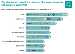
What ~300 exits over 3 years show about funding today's climate tech cohort
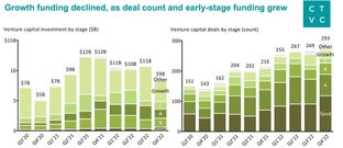
Fewer dollars, more climate innovation in 2022 climate tech market report
 Investing